
The G20 is made up of the leading industrialised nations and emerging economies and encompasses 19 countries plus the European Union. Some two-thirds of the world’s population live in a G20 country. Together, the G20 produces approximately 80% of global GDP.
In terms of demographics, the G20 faces a wide range of different challenges. In a number of the traditional industrialized countries, the population has already aged significantly. This is most evident in Japan, where, in 2015, for every 100 persons aged 20 to 64, a total of 47 were aged 65 and over. This ratio known as the old age dependency ratio was also high in Italy (38) and Germany (35).
However, demographic change is affecting the other G20 countries as well. United Nations population projections for the year 2050 indicate that the old age dependency ratio is set to increase in all G20 countries. A particularly large increase is expected in the Republic of Korea and in China. Between 2015 and 2050, in the Republic of Korea, the number of senior citizens per 100 persons aged 20 to 64 is expected to rise from 20 to 72. In China the dependency ratio is predicted to rise from the current figure of 14 to 51.
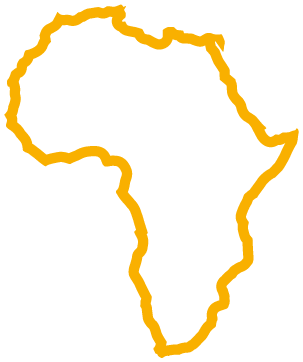
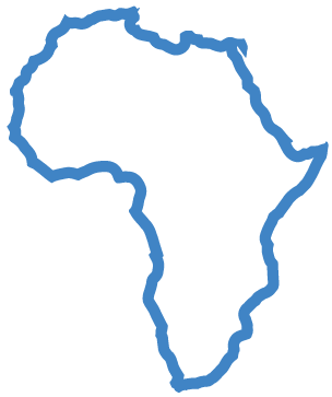
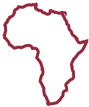
From a demographic point of view, Africa is the youngest continent. Here, population ageing – which has progressed considerably in numerous G20 countries – is not really an issue. In 2015, for every 100 persons aged 20 to 64, approximately 8 were aged 65 and over, meaning Africa’s old age dependency ratio was significantly lower than that of other continents.
The youth dependency ratio paints a similar picture: In 2015, for every 100 persons aged 20 to 64 there were 34 people aged under 20 in Europe compared to 113 in Africa. The ratios for all other continents were between 40 and 60, with the average global ratio amounting to 59.
UN population projections for Africa predict that, by 2050, the continent’s population will more than double, from some 1.2 billion in 2015 to 2.5 billion in 2050. The number of persons aged 20 to 64 will see a disproportionately strong increase. This means that 35 years from now, there will be some 750 million more people of working age in Africa than there are today.
The world is currently experiencing one of the largest refugee flows since the Second World War. According to UNHCR data, in 2015 just under 65 million people were displaced worldwide. This is equivalent to almost one percent of the world’s population.
The largest number of displaced persons sought protection within their own country: The number of internally displaced persons amounted to approximately 38 million. An additional 16 million refugees and three million asylum seekers left their home countries in search of protection.
Most refugees who fled their country ended up staying in neighbouring countries. The countries providing shelter to the largest numbers of refugees in 2015 were Turkey (2.5 million), Pakistan (1.6 million) and Lebanon (1.1 million). More than half of all refugees (54%) in 2015 came from three countries: Syria (4.9 million), Afghanistan (2.7 million) and Somalia (1.1 million).
There is an increasing demand for data relating to migration, forced displacement and asylum seekers. And yet the availability of reliable official international data on these issues is limited.
Compiling accurate statistics on migration is a challenging task. Many people fleeing their homes remain within their own country, others travel in search of protection for months or even years, often spending short periods of time in many different countries. The protection offered to refugees by host countries also varies greatly, ranging from asylum to protection in accordance with the Geneva Refugee Convention to subsidiary protection. Some refugees are granted temporary suspension of deportation, others are given notice that their application for asylum has been rejected.
In addition to the people fleeing from conflict or natural disasters, there are also many who emigrate abroad for other reasons. The increasingly globalised labour market, educational opportunities abroad and family members who live in other countries are all factors that influence the propensity to migrate. And as with refugees, people moving abroad for other reasons also stay for different lengths of time – some just on a short-term educational visit, others deciding to move for good.
Although current migration data is available for many countries, the collection methods vary to such an extent that data comparability is impaired. For example, some G20 countries only provide data on the foreign born population, while other countries only compile data on residents by citizenship.
The Population Division of the United Nations Department of Economic and Social Affairs (UN DESA) calculates a net annual migration rate for every country and region in the world, based on five year periods. This rate indicates the net number of migrants per 1,000 inhabitants moving to or from a country per year. If the number of incoming migrants is higher than the number of those emigrating, the rate is positive. If the number of outgoing migrants is higher, the rate is negative. The data for the period from 2010 to 2015 therefore provides an approximation of recent migration activity.
According to data for the G20, countries such as Australia, Canada and Saudi Arabia saw significantly larger numbers of migrants moving to, as opposed to leaving, their countries between 2010 and 2015. According to data published by the Federal Statistical Office, Germany also had a high net rate of immigration, increasing significantly from 0.4 (2005 to 2010) to 5.9 (2010 to 2015). The trend in Turkey was similar: From 2005 to 2010 the country experienced a net outflow of migrants (-0.1) followed by a sharp increase in the immigration rate (+5.3) for the period 2010 to 2015.
In the South American G20 countries Argentina and Brazil emigration and immigration were fairly balanced in the years 2010 to 2015. In China, India, Indonesia and Mexico the number of migrants leaving slightly outweighed the number of people arriving during this period.
A brief look at the situation on the African continent shows that the net migration rate for the Sub-Saharan countries was slightly negative (-0.2). For the period from 2005 to 2010, it was 0.0. A larger net outflow of migrants can be observed for the six countries of North Africa: Egypt, Algeria, Libya, Morocco, Tunisia and the Sudan. During the period from 2010 to 2015 the net rate here amounted to 1.9 migrants per 1,000 inhabitants.
The declared objective of the G20 is to achieve strong, sustainable and balanced global economic growth. Altogether, the G20 accounts for approximately 80% of global economic output.
According to International Monetary Fund (IMF) estimates, the global economy grew by around 3.1% in 2016, adjusted for inflation. For 2017, the forecast predicts a slightly higher growth rate of 3.5%. Almost all G20 countries have recovered since the economic and financial crisis of 2008/2009.
The highest increases for the period 2010 to 2016 were recorded by China and India, with a real change to their gross domestic product (GDP) of 56% and 48% respectively. In Japan and in the South American and European G20 members GDP growth was more moderate during this time period.
The difference in growth rates has resulted in a shift of the economic weight of the various countries within the G20 over the past 20 years. Adjusted for inflation and purchasing power parity, the United States economy’s share of global economic output has decreased by 4 percentage points from 20% in 1995 to 16% in 2015. Over the same time period, the European Union’s share has decreased by 8 percentage points. On the other hand, Brazil, the Russian Federation, India, China and South Africa – the so called BRICS countries – saw a significant increase in their economic relevance. Their share of the global economy rose from 18% to 31% over this twenty year period.
The state of public finance is best assessed by looking at indicators such as the general government budget balance and the level of gross debt – both expressed in terms of the respective country’s GDP.
The majority of the G20 countries recorded a deficit in their general government balance in 2016. This means that public sector annual expenditure exceeded the level of revenue. Only the Republic of Korea and Germany registered a budget surplus (of +0.3% and +0.8% of GDP respectively).
In addition to the deficits recorded for the past budgetary year, many G20 countries also have a high level of gross debt. This notably includes Japan, where gross debt in 2016 was more than double the level of its GDP. The amount of gross debt was also higher than current GDP in Italy (133% of GDP) and the United States (107%).
In the United Kingdom and Japan the level of gross debt has increased considerably over the past ten years. Between 2006 and 2016 it rose from 184% to 239% of GDP in Japan. The United Kingdom also recorded a large increase during this time period with gross debt rising from 41% to 89% of GDP.
The gross national income (GNI) represents the total income generated by all inhabitants of a country in a given year and is another key indicator to assess the state of a country’s economy.
A comparison of all G20 members adjusted for differences in purchasing power shows that the United States recorded the highest GNI per capita in 2015. In the US, per capita income was around 3.7 times greater than the worldwide average. GNI was also over three times the worldwide average (= 100) in Saudi Arabia (351) and Germany (314).
Only five G20 members were below the global average – Brazil, China, South Africa, Indonesia and India. In India, GNI amounted to 39% of the world average. China has seen its GNI per capita surge in recent years, from 51% in 2005 to 91% of the global average in 2015.
Income and wealth have a major impact on personal living standards, and also have a bearing on the extent to which we are able to take part in social and cultural activities.
The World Bank publishes data on income distribution in the various G20 countries based on household surveys. The international comparability of this data is however limited due to the fact that the national household surveys are not sufficiently harmonised and differ in terms of methodology and compilation period. In some countries for instance the income distribution is approximated using consumer expenditure data.
Among the G20 members surveyed, Germany has the lowest inequality with respect to income distribution. In 2011, the 10% of the population with the highest incomes (highest decile) had around 24% of the total income at its disposal while the 10% with the lowest incomes (lowest decile) accounted for around 3% of income.
South Africa recorded the highest level of income inequality among the G20 members. Here, the 10% of the population with the highest level of income had more than half (51%) of the country’s income at its disposal in 2011, while the lowest decile disposed of just 1%. In Brazil and Mexico income is also more unevenly distributed than in many other countries. Data for 2014 shows that the share of the total income held by the top 10% decile was around 40% for both countries. The lowest decile had to make do with 1.2% (Brazil) or 1.9% (Mexico) of the total income.
In a globalised world, stable trade relations and cross-border investment are of fundamental importance. Trade has accordingly been a constant item on the G20 agenda since the first summit took place in Washington in 2008.
According to data published by the World Trade Organization, 77.5% of all goods and services exported worldwide in 2015 came from a G20 member and 76.5% of all goods and services imported were destined for the G20. In 2015, the largest trading nations were China and the United States.
The United States imported merchandise and commercial services worth 2,806 bn US$ – representing a 13% of the global import market. China followed with imports of 2,148 bn US$ and a 10% share of the worldwide market. As far as exports of goods and services are concerned, China was the country with the highest trade volume amounting to 2,560 bn US$, followed by the United States with a total of 2,213 bn US$. China’s share of global exports totalled 12%, the US share was 10%.
In 2015, Germany ranked third in terms of imports (1,342 bn US$) and exports (1,579 bn US$) followed by the United Kingdom in fourth place.
If the 28 EU states are considered as a single trading partner and intra-EU trade flows are discounted, the European Union’s trade exceeds that of China or the United States in terms of both imports and exports. In 2015, the volume of goods and services exported to non-EU countries by the EU Member States amounted to 2,900 bn US$, according to WTO figures. The imports into the EU totalled 2,646 bn US$.
Foreign trade is of particular economic relevance in Germany and the Republic of Korea. In both these countries, total exports and imports expressed as a proportion of gross domestic product – also known as the trade ratio – amounted to more than 80%.
In the United States, the domestic market is of considerably more economic importance. The foreign trade ratio here amounted to 28%. Foreign trade also played a far less significant role for the South American G20 economies Brazil (26%) and Argentina (23%).
An economy’s trade balance represents the difference between exports and imports of goods and services. The trade balance ratio expresses this balance in relation to an economy’s gross domestic product. If the ratio is positive, this shows what proportion of a country’s gross domestic product is used neither for consumer expenditure nor for investment within the domestic economy. In 2015, the Russian Federation (8.2%), Germany (7.0%), the Republic of Korea (5.4%), China (3.7%) and Italy (2.5%) registered a positive ratio.
A negative ratio shows the percentage by which domestic consumer expenditure and investment exceed domestic production. According to World Trade Organization (WTO) data, the biggest trade balance deficits among the G20 states were recorded by South Africa (-7.5%), Saudi Arabia (-7.2%) and Turkey (-4.6%) in 2015.
Investment and development aid are an important motor for economic growth and innovation. In 2015, according to the United Nations Conference on Trade and Development (UNCTAD), foreign direct investment (FDI) stocks in Africa totalled 740 bn US$. Over a quarter of this investment (206 bn US$) came from the European Union. At individual state level, the United States (64 bn US$) and the United Kingdom (58 bn US$) were the main investing countries. Since 2009, many foreign companies and private individuals have substantially expanded their investment stocks in Africa. This particularly applies to China: foreign direct investment stocks from the People’s Republic rose from 9 bn US$ in 2009 to just under 35 bn US$ in 2015. South Africa was the country which attracted the highest accumulated stock of foreign direct investment, totalling 125 bn US$ in 2015. The top 5 recipient countries also included Egypt (94 bn US$), Nigeria (90 bn US$), Morocco (49 bn US$) and Tunisia (33 bn US$).
While stocks give an indication of long-term investment patterns, investment flows enable a more specific look at activity within a certain period. In 2015, approximately 3.1% of total global FDI flows, representing a total of about 54 US$ bn, were invested in Africa. The main recipient was Angola (8.7 bn US$), followed by Egypt (6.9 bn US$), Mozambique (3.7 bn US$), Morocco (3.2 bn US$) and Ghana (3.2 bn US$).
Official development assistance (ODA) on the African continent totalled 51 bn US$ in 2015, according to OECD figures. ODA funding by states and institutions is used amongst other things to help ease humanitarian emergencies, strengthen democratic structures, promote gender equality, and protect the environment.
Official development assistance includes grants, debt cancellation and loans from the states which form the OECD Development Assistance Committee (DAC). In addition, support also comes from non-DAC countries, as well as from multilateral development cooperation institutions such as the United Nations or the World Bank.
As in previous years, the majority of ODA for Africa in 2015 came from DAC states (27 bn US$). EU institutions and EU states organised within the DAC supported the African continent with a total of 18.3 bn US$. The biggest bilateral DAC donors were the United States (9.3 bn US$), the United Kingdom (4.2 bn US$) and Germany (3.0 bn US$).
While almost three quarters of 15- to 64-year-olds in Japan, Germany and the United Kingdom are in employment, in other G20 countries such as Saudi Arabia and Turkey, only about one in two people are gainfully employed. The lowest G20 employment rate in 2015 was registered in South Africa (43.7%).
The female employment rate lags behind the male employment rate in all G20 countries. The difference is relatively small in some countries, with France and Canada recording just a little over six percentage points between the male and female employment rate in 2015.
There was a single digit gap in the United Kingdom, the Russian Federation and Germany too, but it is significantly higher elsewhere. In Saudi Arabia, for instance, 78% of men and only 18% of women had jobs in 2015. In Turkey, 70% of men were in work compared to 30% of women.
The G20 has set itself the objective of reducing the gap between male and female employment by 25% by 2025.
Besides the gap in the labour force participation rate, there are also – often quite substantial – gender differences between the G20 countries when it comes to earnings. Eurostat, the Organisation for Economic Co-operation and Development (OECD) and the International Labour Organization (ILO) all publish data on the so-called gender pay gap, but there are differences in terms of their methodological assumptions.
According to the OECD, the gender pay gap was particularly large in the Republic of Korea and Japan. In 2014, women earned 37% less in relation to men’s median earnings in Korea, and 26% less in Japan. But the pay gap was in double figures in many other G20 countries too, including Germany and the United Kingdom, where the OECD measured a gap of 17%.
These figures represent what is known as the unadjusted gender pay gap. A significant proportion of the disparity in earnings can be explained by structural differences – in other words by different choices in terms of profession or employment sector chosen or by the fact that men are more often in senior positions than women.
In the 2012 study “Closing the Gender Gap” the OECD analysed which proportion of the gender pay gap can be explained by differences in terms of qualifications, career choices and work experience. In all countries included in the study a significant part of the unadjusted pay gap could not be explained by one of these factors, meaning that a gender-based difference in wages remained measureable even after adjustment.
The OECD gender pay gap data does not include part-time employment. Adding this aspect to the equation, leads to a further increase in the gender pay gap. A glance at the part-time figures for 25- to 54-year-olds in G20 countries shows how relevant this factor is. In all G20 states, a higher proportion of women than men work part time.
The most significant differences were recorded in the European G20 countries in 2015, particularly in Germany and the United Kingdom, where the gap between men and women amounted to 31 and 28 percentage points respectively. In Australia and Japan, women were also considerably less likely to work full time than their male colleagues. Even in countries, where part-time employment is less common, such as the Republic of Korea or the United States, the figures still point to a substantial gender difference.
Unemployment is often a serious economic and social problem for those affected. However, a high rate of unemployment also has economic and social consequences for society as a whole.
Overall, the labour market situation is currently fairly good in a large number of G20 countries. In ten of them, the unemployment rate among people aged 15 and above was lower than 6% in 2015.
At the moment South Africa, Turkey and the two Mediterranean EU members in the G20, France and Italy, face the greatest challenges. All four had double-digit unemployment rates in 2015. In the European Union, the average rate was 9.4%. France and Italy were not the only Mediterranean countries to be relatively badly affected, with Greece on 25%, Spain on 22% and Portugal on 13%.
Consistently high youth unemployment is a considerable problem facing a number of G20 countries. The United Nations’ sustainability strategy includes the endeavour to significantly improve young people’s career prospects. Target 8.6 of its Sustainable Development Goals is to substantially reduce the proportion of youth not in employment, education or training by 2020.
Poor prospects in terms of finding a good job and earning a decent wage are among the most significant factors when it comes to the propensity of young people to emigrate. The International Labour Organization (ILO) found that, across the globe, around 71 million people between the ages of 15 and 24 were unemployed in 2016. However, the situation for young people starting their careers is by no means identical in all the G20 countries. India, Mexico, Germany and Japan had youth unemployment rates of less than 10%. By contrast, high rates – some of which exceeding 20% – were recorded in South Africa, Saudi Arabia and many EU countries, including Italy and France. In South Africa, more than half of all 15- to 24-year-olds were not in gainful employment.
The ILO estimates that the average unemployment rate for the African continent as a whole amounted to approximately 8% in 2016. That equates to around 37 million people out of work. Fifteen million of them were under the age of 25. On the basis of its forecast models, the ILO calculates that, even if the unemployment rate remains at 8%, population growth will mean that an additional 2.3 million will be without work in two years’ time.
The comparatively low rate of 8% somewhat obscures the fact, that a very high percentage of the work force are self-employed and working for very low wages.
The labour market also varies significantly from region to region. Six of Africa’s 54 countries recorded unemployment rates of more than 20%, including South Africa (25.9%) and Mozambique (24.4%). In Nigeria and Ethiopia, however, the two most populous countries in Africa, less than 6% were unemployed. The average rate in Sub-Saharan Africa was 7.2%, slightly lower than the overall African average. The challenge here is primarily to improve the quality of jobs and the working conditions.
According to ILO estimates, a very high proportion of people in Sub-Saharan Africa (68%) were self-employed or contributing family workers in 2016. The global average amounted to 43%.
A breakdown of the employment data by income level highlights how many people in Sub-Saharan Africa are affected by in-work poverty. One in three persons employed earned less than the equivalent of 1.90 international US$ per day. Another 30% had to get by on a daily income between 1.90 and 3.10 international US$. Altogether 64% of people in work were earning less than 3.10 international US$ a day. This compares with the six countries that comprise North Africa, where only 24% of those employed were working for such low income.
One of the G20 goals is to foster good and productive employment. Besides improving the situation of employed women and increasing female labour participation, one key focus is to more effectively integrate migrants into the labour market.
The OECD offers data on employment by country of birth for 12 of the G20 members. The data show that the employment rate of foreign-born persons varied considerably from one country to the next in 2015, with Turkey (44%) at the lower end of the scale and Canada (71%) at the upper end.
In most G20 countries the employment rate of the foreign-born population was lower than that of the native-born population. The difference was largest in France and Mexico. Italy, the Republic of Korea and the United States were exceptions to this rule: Here, people born abroad were more frequently in employment than those born within the respective country.
The unemployment rate paints a similar picture. In most countries foreign-born unemployment was higher than native-born unemployment. This was particularly the case in Europe. The unemployment rate of the foreign-born population in France was almost 8 percentage points higher than the native-born rate.
In Italy the difference amounted to 4.2 and in Germany to 3.6 percentage points, significantly higher than the level in other G20 members. Of the countries analysed, Australia and the United States were the only two where the foreign-born unemployment rate was not higher than the native-born rate.
Increasing digitalisation is one of the motors of globalisation and is impacting on more and more aspects of our lives. Notwithstanding all the challenges and risks, it offers tremendous potential for innovation, opportunities for enhanced economic and social participation, and new possibilities in the fields of education and employment.
Digital trade, social media, videoconferencing – the world is becoming ever more interconnected. In order for as many people as possible to benefit from the new opportunities, the G20 wants to develop an international framework for action for the digital future.
This includes setting up international standards, improving access to digital technology, promoting lifelong digital learning and strengthening trust in digital products and services.
According to estimates from the International Telecommunication Union (ITU), just under half of the world’s population (47%) used the Internet in 2016. On the African continent the figure was considerably lower, at 25%. Internet access is much more widespread in Europe, where almost 80% of the population used the World Wide Web.
Internet usage varied widely among the G20 states in 2015, with rates extending from below 30% in India and Indonesia to 90% and more in the Republic of Korea, Japan and the United Kingdom.
In most G20 countries, there was little difference in Internet use between women and men. In Turkey, Saudi Arabia and Italy, however, the percentage of women using the Internet was significantly lower than the usage rate of men.
If business and society are to make use of the diverse possibilities offered by digitalisation, high-performance technical infrastructure must be in place. The number of fixed broadband Internet connections has increased continuously in the past few years all over the world.
Among the G20 member states, France and the Republic of Korea had the highest density in 2015, with 41 and 40 connections per 100 inhabitants respectively. Germany (37) and the UK (38) also considerably expanded their high-speed networks in recent years.
In Indonesia, India and South Africa, broadband connections are still rare. But they are becoming more widespread there, too. Between 2005 and 2015, the number of broadband connections per 100 inhabitants rose from 0.1 to 1.1 in India and from 0.3 to 5.3 in South Africa.
It is important to stress that this ITU indicator measures the number of connection subscriptions per population and cannot be equated with the proportion of households with broadband Internet access. Data on the latter topic is provided by Eurostat for the European countries. According to Eurostat, 87% of UK and 86% of Germany’s households had a fixed broadband access in 2016. The EU average rate was 74%. Households in France had a 72% connection rate. Italy’s household broadband rate was somewhat lower at 55%.
These days it is almost impossible to imagine life without mobile phones. Rarely has an electronic device established itself worldwide as quickly as mobile phones have. In almost all G20 states, there are now more mobile phone subscriptions than inhabitants. In 2015, Saudi Arabia was the world leader, with 177 mobile phone subscriptions per 100 inhabitants, followed by the Russian Federation with 160. In Germany there were 117 mobile phone subscriptions for every 100 inhabitants. India was the G20 country with the lowest coverage in 2015 (79).
Given the advance of digitalisation, digital skills are becoming an increasingly important factor for the future prospects of a society.
The United Nations Educational, Scientific and Cultural Organization (UNESCO) offers data on the proportion of students graduating in information and communications technology (ICT). The figures show that in 2014 graduation in an ICT course was considerably more common in countries such as Indonesia (9.8%), Saudi Arabia (7.1%) and India (6.8%) than in Italy (0.9%), for example. The United Kingdom, South Africa and Brazil (all around 3.5%) were in the middle of the field in terms of ICT qualifications.
ICT graduates have successfully completed a course relating to computer use, database and network design and administration or software and applications development and analysis.
To date, digitalisation has made little headway on the African continent. Around three quarters of the Sub-Saharan African population aged 15 and over were offline in 2016. Only 15% of households had a private Internet connection. The global average was 52%. Particularly people in rural were often without access to the World Wide Web.
ITU data also shows that women are not benefiting to the same degree as men from the possibilities afforded by digitalisation: the Internet gender gap in Sub-Sahara Africa was 23% in 2016, considerably higher than the global figure of 12%. The gender gap represents the difference between the Internet user penetration rates for men and women relative to men’s Internet user penetration rate, expressed as a percentage.
However, Internet-enabled mobile phones are becoming more prevalent in Sub-Sahara Africa, too: in 2016, there were on average 29 mobile phone subscriptions with mobile broadband Internet access per 100 inhabitants. The worldwide average figure is 49.
According to the Sustainable Development Goals, the United Nations aims to end hunger, achieve food security and better nutrition as well as promote sustainable agriculture. These targets place a stronger emphasis on the quality aspects of agriculture.
In many countries, the agricultural sector is no longer very significant in economic terms. Comparing the 2015 data for all G20 states, the share that agriculture contributed to the gross value added was highest in India (17.0%), Indonesia (14.0%), China (9.2%) and Turkey (8.6%). In Germany and the United Kingdom, the agricultural sector accounted for less than one percent of gross value added.
Water plays a key role in terms of food security: According to United Nations estimates, some 70% of global water is used in the agricultural sector, 20% in the industrial and energy sector and 10% in private households. The need for agricultural water, however, varies considerably from one country to the next. Influential factors are the economic importance of agriculture, the available water resources, climatic conditions, the availability of technical irrigation facilities and the quality of water management.
According to the Food and Agriculture Organization of the United Nations (FAO), agricultural activities account for more than 80% of water use in India, Saudi Arabia, Indonesia and Turkey. In more industrialised nations such as Germany, France or Canada, agricultural water use plays a far less central role. In these countries, water is mainly used for energy production or the industrial sector.
In view of global population growth, the need for water is set to increase further in coming decades, especially in emerging economies. And yet in many regions of the world, water resources are already scarce. Efficient and sustainable water management is therefore of increasing importance.
FAO data availability on water is somewhat fragmentary. Unfortunately up-to-date information is not available for all countries. According to hydrologists, areas are classified as suffering from water scarcity when the amount of renewable water resources per person and year amounts to less than 1,000 m3. The available data for 2014, shows that Saudi Arabia and South Africa are both affected by water scarcity. The fact that Saudi Arabia’s annual water consumption per capita is particularly high (908 m3) further exacerbates the problem. In order to guarantee a sufficient water supply this G20 country is reliant upon seawater desalination and non-renewable groundwater.
Countries with renewable water resources between 1,000 and 1,700 m3 per person and year experience what hydrologists classify as water stress – here temporary water supply problems are to be expected. Among the G20 countries, the Republic of Korea and India fall within this category.
According to United Nations estimates, the global demand for agricultural products is set to increase by approximately 70% by the year 2050, in particular due to global population growth.
From 2000 to 2014, agricultural productivity in Indonesia and Brazil increased by more than 70%. In India and China, agricultural productivity also increased considerably, rising by more than 50%. The intensive use of irrigation methods was one of the factors driving these significant productivity increases.
Even though, on a global scale, there was a marked increase in productivity, it actually dropped during the same period in a number of industrialized nations that use intensive farming techniques (-11.2% in Italy, -7.0% in Japan and -1.4% in France).
Although the number of people affected by malnutrition has decreased worldwide by about one fifth since 1990–92, FAO data indicate that some 800 million people in the world still suffer from undernourishment. Nearly 70% of those affected live in Sub-Saharan Africa, China and India. China in particular has achieved notable success in the fight against hunger: Since the early 1990s, the number of undernourished people there has been cut by more than half. However, combatting hunger remains a formidable challenge, especially in Africa. In Sub-Saharan Africa, the number of undernourished people has increased by 25% since the early 1990s. And in India the number of persons affected has remained more or less unchanged at 200 million for some years now.
Organic farming conserves natural resources, avoids the use of pesticides and promotes the sustainability of economies.
The four EU Member States in the G20 lead the way in terms of organic agriculture. With a 10.5% share in 2014, Italy heads the list, followed by Germany (6.3%), Australia (4.2%), France (3.9%) and the United Kingdom (3.0%).
In ten G20 countries, organic farming is still very much a niche market, with the proportion of agricultural area designated to eco-certified production remaining below 1%.
In the Paris Climate Agreement negotiated in 2015, the international community set itself the goal of limiting global warming caused by greenhouse gases to well below 2°C. In total, more than 140 countries have ratified the Paris Agreement to date.
Carbon dioxide (CO2) is the main greenhouse gas and is produced when burning fossil fuels. In 2015, China was responsible for almost 30% of total CO2 emissions worldwide, making it the greatest emitter. Other major contributors to global emissions were the United States (14%), the European Union (10%), India (7%) and the Russian Federation (5%). Together, the G20 countries were responsible for more than 81% of global carbon dioxide emissions in 2015.
But looking beyond total emissions and relating them to each country’s population provides a different view of the situation. In terms of the carbon dioxide emitted per capita, Australia, the United States, Saudi Arabia and Canada are by far the greatest emitters with levels of more than 15 tonnes per year and inhabitant.
China’s per capita emissions are considerably lower (7.7 tonnes), but have risen in recent years and now exceed the EU average of 6.9 tonnes. Germany is also well above the EU average with 9.6 tonnes per capita. Per capita levels in India, Indonesia, Mexico, Turkey and the South American G20 countries are below the global average of 4.9 tonnes.
In many G20 countries, carbon dioxide emissions have increased sharply since 1990. China recorded a particularly sharp increase, with its annual CO2 emissions more than quadrupling between 1990 and 2015 (+364%). However, emissions in India (+278%), Indonesia (+215%) and Saudi Arabia (+202%) also rose considerably.
A number of G20 countries, including the United Kingdom (-31%), the Russian Federation (-26%) and Germany (-24%), emitted less carbon dioxide in 2015 than in 1990.
In a world where key natural resources are becoming increasingly scarce, it is vital that societies find ways of securing an energy supply that require less material input. The aim is to minimise quantitative and qualitative energy loss in the conversion, transportation and storage of energy by boosting efficiency.
In 2014, China had the highest level of primary energy supply of all G20 countries, with more than three billion tonnes of oil equivalent (toe), followed by the United States with 2.2 billion and the European Union with 1.5 billion toe.
Primary energy supply per capita was highest in Canada (7.9 toe), followed by the United States and Saudi Arabia (6.9 toe each). Per capita consumption in countries such as India (0.6 toe) and Indonesia (0.9 toe) or Brazil and Mexico (1.5 toe each) was significantly lower.
To evaluate energy efficiency, the International Energy Agency (IEA) analyses the energy intensity of the economy. This involves measuring how much energy is required to achieve a certain amount of economic output.
According to IEA data, the EU Member States achieve the best results of all G20 countries. In the United Kingdom, for example, only 0.06 kg oil equivalent (kgoe) of energy were needed to produce one international dollar of its gross domestic product (GDP). Italy (0.07 kgoe), Germany (0.08 kgoe) and France (0.09 kgoe) also reported similar figures. The South African (0.42 kgoe), Indian (0.40 kgoe) and Russian (0.35 kgoe) economies were considerably more energy intense.
A sustainable approach in terms of how we use natural resources is inconceivable without expanding the use of renewable energy. The renewable share of primary energy supply differs considerably from one G20 member to the next: In 2014, renewable energy remained virtually untapped in Saudi Arabia, the Republic of Korea and the Russian Federation. By contrast, countries such as Brazil (39%), Indonesia (34%) and India (25%) used hydropower, biomass, solar power or other renewable energy sources to a far greater extent.
In 2014, the electricity generated by renewables worldwide totalled 5,294 terawatt-hours (TWh) according to the International Renewable Energy Agency (IRENA). Three-quarters of this amount (74%) were generated by hydropower, followed by wind power (13%), biomass (8%), solar power (4%) and geothermal power (1%).
In a number of EU countries, the share of electricity generated by renewables has seen a sharp increase in recent years. This was particularly the case in Italy, where the share of renewables rose from 19% to 43% between 2000 and 2014. The proportion of electricity from renewable sources also increased significantly from 6% to 26% in Germany and from 3% to 20% in the United Kingdom.
In 2016, according to the United Nations Environment Programme (UNEP), investment in renewables (excluding large hydro projects) fell by 23% on the previous year to 241.6 bn US$. However, at the same time the amount of new capacity installed increased from 127.5 Gigawatts (GW) in 2015 to a record 138.5 GW in 2016. A major reason why installations increased despite less investment were sharp cost reductions for photovoltaic systems, onshore and offshore wind.
Compared to 2015, investment particularly decreased in Asia: Japan saw a year on year decrease of 56% to 14.4 bn US$ and China’s financing dropped by 32% to 78.3 bn US$. Nevertheless, Asia still accounted for 48% of the global amount invested in renewables. Almost every third dollar committed worldwide (32.4%) came from China, which remains the leading country as far as financing renewables is concerned. The United States came second with investment of 46 bn US$, down 10% on 2015. Europe was the only continent to see an increase in investment in 2016, with the total reaching 59.8 bn US$. This represents just under a quarter of the global amount invested in renewables.
Globalisation is leading to new challenges for the health sector. The rise in international trade and travel means communicable diseases can spread more quickly and further afield than they used to.
Accordingly, the G20 is looking to enhance global health-crisis management and to bring about lasting improvement in the healthcare systems of developing and newly industrialising countries. The G20 members also see a need for action as far as the fight against antimicrobial resistance is concerned.
The outbreak of the Ebola epidemic in Africa in 2014 and the spread of the Zika virus in Central and South America in 2015 are just two recent examples which highlight the importance of efficient global crisis management in the health sector.
As of 2007, the International Health Regulations (IHR) drafted by the World Health Organization (WHO) apply in almost all countries worldwide. These regulations help to prevent and combat the spread of diseases across borders. Under the IHR, countries are obliged to report the outbreak of certain diseases to the WHO and to carry out specific measures to prevent and combat them.
The WHO conducts annual surveys in all UN Member States in which the public authorities evaluate various capacities in terms of IHR adherence. If a country considers that it fully meets all WHO requirements in a particular capacity, it is assigned an index value of 100.
The WHO data illustrates that many G20 countries reached a positive assessment of their capacities in 2015. The South African authorities for example recorded a score of 100 for all 13 capacities, including aspects such as risk communication, food safety and chemical incidents. Australia, Canada, China, Germany, Japan, Saudi Arabia and the United States reported similarly high scores. According to the self-assessments Argentina, Italy and Turkey still have room for improvement in certain capacities. However, it should be noted that the most recent data for Italy relates to 2011.
Analysing the individual capacities in detail, the data shows that there are still deficits in a number of countries as far as chemical incidents and points of entry are concerned.
The WHO has recently also developed a Joint External Evaluation (JEE) tool together with partner organisations, which aims to ensure an assessment of IHR-adherence by an independent evaluator. Countries can voluntarily opt-in to the JEE assessment method. It is vital that the IHR are fully enforced worldwide in order to ensure the early detection and control of local outbreaks. The strengthening of local health systems is of great importance in this context.
Health expenditure varies considerably among the G20 members. The population’s age structure, general health awareness and the current structure of the healthcare system all have a significant impact on the level of funding required.
There are differences in terms of the methodology used by countries to calculate health expenditure which lead to a reduced cross-country comparability. The data published by the OECD – using supplementary WHO data for Saudi Arabia and Argentina – provide the best basis for a comparison of the G20 countries. According to these figures, expenditure in 2014 was highest in the United States, where the amount spent per capita (by the public sector and individuals) amounted to almost 9,000 international US$. This is the equivalent of almost 17% of GDP.
Health expenditure in Japan, Germany and France (11% of GDP in each country) and in Canada (10%) was also above average. Per capita expenditure amounted to between 4,000 and 5,200 international US$ in these countries.
Significantly less is spent on health in the developing and newly industrialising countries. Health expenditure amounted to just under 5% of GDP in India and approximately 3% of GDP in Indonesia. It is however important to remember that the level of spending alone is only one aspect when it comes to evaluating system efficiency or the level of health care provision.
Not only the level of expenditure differs from one country to the next, the system of health care funding – and in particular, the share of costs covered by public finance – also varies. For example, only 30% of India’s and 38% of Indonesia’s health expenditure was covered by the public sector and compulsory health insurance contributions. In the United States, the public finance share amounted to 49%. By contrast, 85% of healthcare system funding in Japan and Germany was provided by the public sector and compulsory health insurance contributions.
In order to achieve the ambitious aims laid out in the United Nations Sustainable Development Goals
On a global scale, life expectancy has increased by an average of 20 years over the last 50 years. A number of factors have contributed to this overriding trend, including improved sanitation, better working conditions, new vaccines and other medical breakthroughs. Antibiotics, first used to fight bacterial infections more than seventy years ago, also played an important part in this process. World Bank data show that life expectancy rose particularly in the world’s most populous countries between 1960 and 2015, increasing by 33 years in China and 27 years in India – starting from relatively low levels in both cases. Japan had the highest life expectancy of all G20 members in 2015 (83.8 years).
At global level, life expectancy at birth exceeded 80 years in more than 30 countries in 2015. However, it was lower than 60 years in over 20 countries, all of which African. According to the World Bank, life expectancy at birth was approximately 50 years – the lowest in the world – in Swaziland, Lesotho, Sierra Leone and the Central African Republic in 2015. The comparatively low life expectancy in many African countries is largely a result of malnourishment and viral diseases, in particular AIDS.
The efficacy of antibiotics in fighting bacterial infections has contributed to the increase in global life expectancy. But the potency of antimicrobial agents is increasingly threatened. Excessive use and misuse of antbiotics, in medicine and in agriculture, is increasing antimicrobial resistance. This resistance is making it more difficult to treat certain infections and resulting in higher costs for health care treatment.
As reported by the WHO, using data from the information service provider QuintilesIMS, there are significant differences between the G20 countries as regards the use of antibiotics. While five standard units per capita were consumed on average in Mexico in 2014, this figure was more than five times higher in the Republic of Korea (28 units).
A comparison of the use of antibiotics over time does not reveal any consistent patterns. Compared to 2000, there has been a sharp decline in use in France and Mexico for instance, but intake has significantly increased in Turkey and China over this period. It should be noted that increased usage is in part a result of better access to antimicrobial agents.
According to the OECD, antimicrobial resistance increased in almost all OECD member countries between 2005 and 2014. A report recently commissioned by the British government (“Review on Antimicrobial Resistance”, O'Neill) concluded that antibiotic-resistant bacteria currently cause some 700,000 deaths per year worldwide. World Bank forecast models predict that antimicrobial resistance will have a tangible impact on health expenditure in the coming decades. Depending on the scenario, the World Bank estimates a cost increase of between 1.1% and 3.8% of global economic output by the year 2050.
The impact of antimicrobial resistance is particularly evident in tuberculosis patients. According to WHO estimates, approximately 10.4 million people were newly diagnosed with tuberculosis in 2015 alone, including 480,000 patients with multidrugresistent tuberculosis and a further 100,000 patients with tuberculosis caused by bacilli showing resistance to the antibiotic rifampicin. Compared to the standard therapy, the treatment of resistant forms of tuberculosis is more complex, more expensive and less likely to be successful.
Of the 580,000 people with multidrug- or rifampicin-resistant tuberculosis, only 125,000 had access to the necessary treatment, while only half of those who received this treatment could be cured. In addition to the need for measures to combat antimicrobial resistance, there is also demand for the development of new antimicrobial agents. Accordingly, the G20 wants to discuss the need for an increase in investment as far as research and development of new pharmaceuticals are concerned.
Antibiotics and other antimicrobial substances are used to combat disease in livestock, and thus also have an impact on food safety and quality. They are used to treat sick animals and to contain the spread of diseases. In some cases, small doses of antibiotics are also added to animal feed in order to promote growth. The use as feed additive was banned by the EU as of 2006, but is still common elsewhere in the world.
In addition to their use in livestock, antimicrobial substances are used in aquaculture and on crops as a pesticide. Estimates on the global use of antimicrobial substances in agriculture vary significantly. According to FAO assumptions, at least 60,000 tonnes are used globally in livestock per year. The G20 countries first discussed this topic at the Hangzhou summit in 2016 and agreed on measures to reduce the use of antimicrobial substances in the G20 Agriculture Ministers’ Declaration 2017.
At present, there is a lack of internationally comparable data on the use of antibiotics in agriculture. The table shows the recent development in the European G20 countries on the basis of data from the European Medicines Agency. According to these figures, use has declined in all four countries since 2010.